Abstract
“Everywhere you look you see typefaces, but there's probably one you see more than any other one and that's Helvetica. You know there it is, and it just seems to come from nowhere. It seems like air and it seems like gravity. It's hard to evaluate it. It's like being asked what you think about off-white paint.” — Michael Beirut
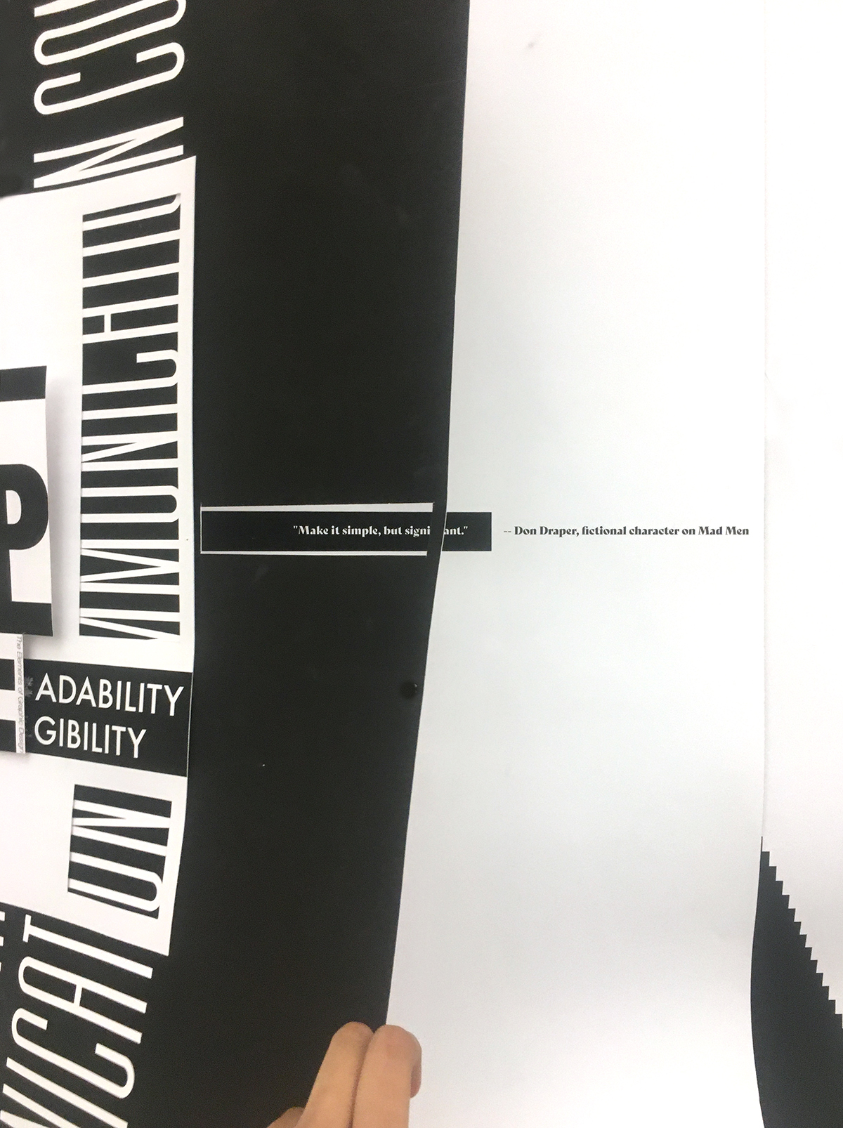
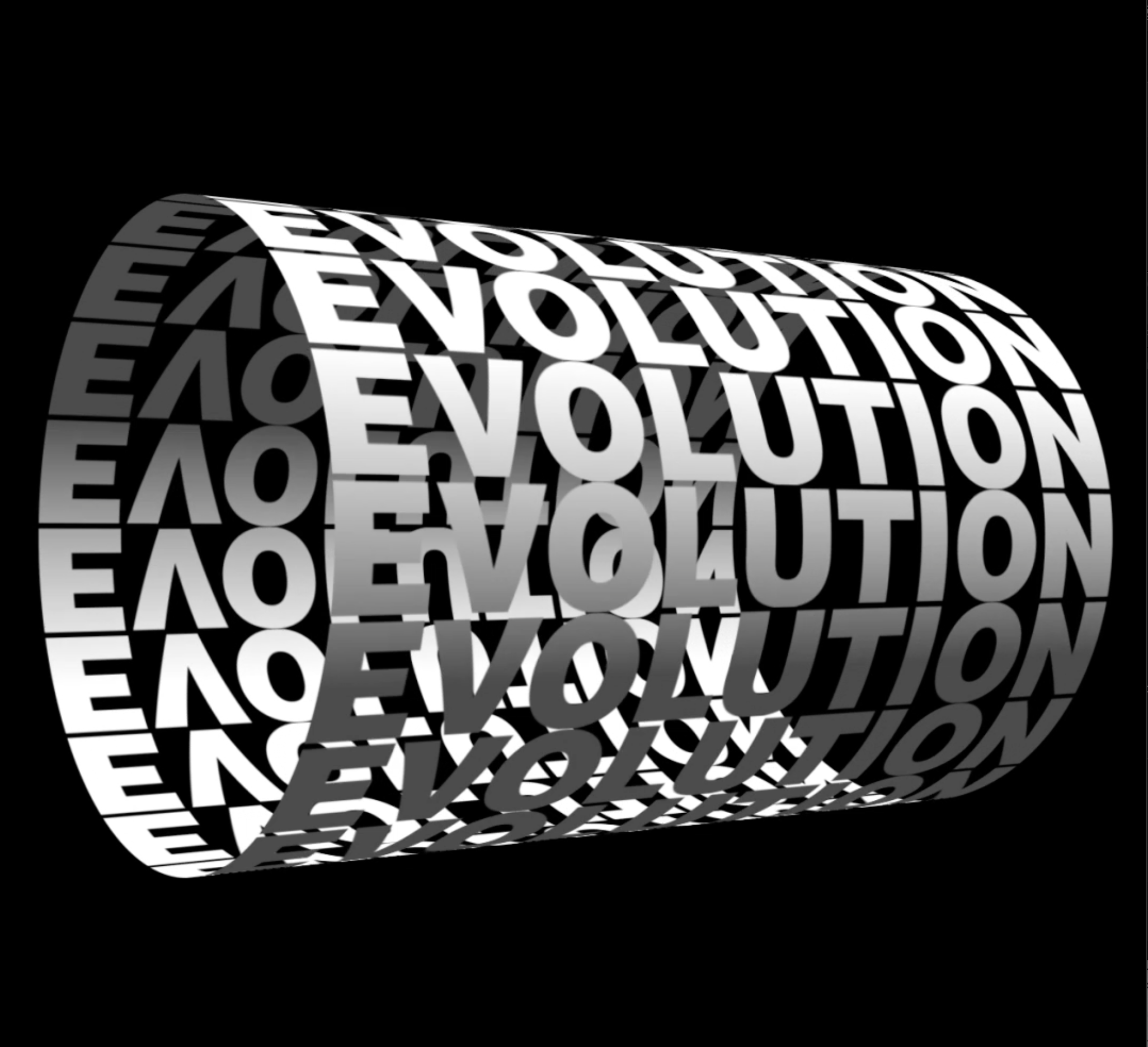
Evolution tracks the elaborate history, construction, and utilization of Helvetica. It interacts with the audience about the extent that they have come into contact with this ubiquitous typeface. The typeface is a popular choice among designers because of its unique archive and influences through time, along with its capabilities to perform beautifully across mediums. It is also unique because of the sheer number of its existing variations and its emotive capabilities, The typeface also thus, reflects the different designers that have a take on its perfection which dates to as recently as 2019.
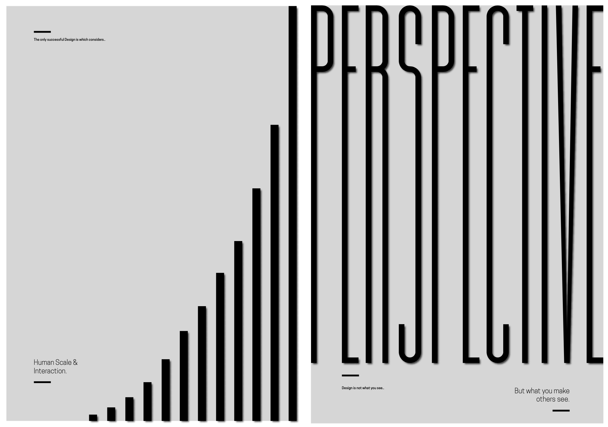
This thesis aims to enquire the personal experiences of a non designer with the typeface, through a series of questionnaires. These stories were then illustrated in an unusual yet clear way, where the different versions of the typeface integrated with 3D forms. A series of posters were made in accordance to the varied responses using a minimalist approach. The concept illustrates the beautiful, bold yet timeless features of the typeface itself, while informing about the critical moments in those stories.


